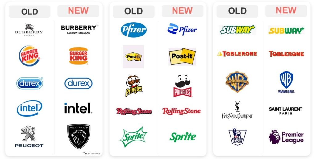
Close your eyes and picture this, you are going to McDonald’s to redeem a coupon for a free burger for meeting some goal at school. You walk into the bright red and yellow palace with Ronald, Grimace, Hamburgler, and the rest of the gang all over the restaurant. You then see the big play place and quickly kick your shoes off to go in and play. It was so fun and nostalgic, but now a days, its boring and grey. McDonald’s is a victim of minimalism. Logos that are minimalized can lose their character and how they identify them.
Most logos while seeming boring, are done to make their lives easier and sometimes it can work in their favor because you build that association to the logo and it becomes that identity.