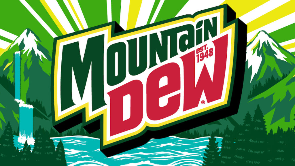
Last time on the blog of Chap, I discussed how McDonalds went from happy place to gray minimalist bore. Now, I would like to discuss an upgrade from a basic logo. Mountain Dew had more of a jagged and pointed logo that came off aggressive. It was marketed towards teens who wanted to get that big time sugar rush. It seems that it has gone back to its moonshining roots and seems more chill and nature forward. To me, this is proof that going against the grain and breaking trends can help stand out.